TBA Pt. 5: Graphics- The Bold Artist
Art has always been my Achilles’ heel when making games. Obviously sound and music are nothing to me as that’s my main area of expertise, RPG Maker is easy enough for an invertebrate like me to get the hang of, and I don’t think I’m terrible at writing either. Visual art, however, is a skill that had eluded me for nearly twenty-seven years.
Changing this was one of the biggest reasons I dove into this jam headfirst. I wanted to take matters into my own hands and give pixel art a serious shot myself. I do well in the trial by fire environment; recall that I went from zero RM experience to 8th place in Harold Jam 2021 with Stuck in the Past in no more than a month and a half. I had recently picked up a copy of Aseprite and wanted to take pixel art seriously in the event I’d need to cover it for my own games. I was originally planning to balance some original art with existing tilesets and maybe a few guest appearances, but as the game went on I became more and more set on doing every single graphic myself which I ultimately achieved.
Palette
I wanted the Game Boy look from the beginning, and as discussed in the Prologue I came up with a four-color palette that fit every characters’ colors. As luck would have it, when I started actually doing pixel art I found out there was a Super Game Boy palette with nearly identical colors! I pivoted over to that without hesitation, and I feel like its slight yellowish tinge in comparison to the old palette adds a sense of nostalgia. It almost looks like the whole game takes place during a really nice sunset.

Influences
Pokémon. Y’all knew it was coming. I spent hours on SpritersResource analyzing so many sprites and tilesets from Red/Blue/Yellow, Gold/Silver/Crystal, and of course the Pokémon TCG game that was a huge influence on H&TCoT as a whole. I also analyzed Game Boy games like Link’s Awakening, Final Fantasy Adventure, Lufia II, and even Bomberman Quest to try and gain a better understand of how different graphic artists would approach a character or object. Understanding how and why every sprite is drawn, colored, and shaded is just as important as the process of drawing it.
Coincidentally enough, I also found myself relying on the game that got me into Harold Jam in the first place! After riding his coattails and stealing his sprites for so long, I heavily referenced Violet Spinel’s character sprites for Axial for the H&TCoT cast. It was kind of a necessity since he also did an 8-bit Harold and I wanted to investigate how he handled the same constraints I was following.
After this jam, I can safely implore any aspiring pixel artist to start with Game Boy sprites. 16x16 characters, 8x8 or 16x16 tiles, four colors, nothing but. It’s fast, helps you understand the fundamentals, and forces you to get creative working under constraints. Just upscale it by 3x to fit it into RPG Maker MV or 2x for VX Ace. I plan to slowly work my way up from there.
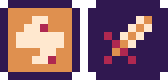
States
Among the first pixel art I did was the icons for each State. I wanted them to resemble cards since card games were on my mind. This was well in the Harold Harvest era, so I ended up drawing Sword and Spark icons instead of the Bonked and Blinded icons that I used for Teebeyae. I started off familiar with MV as you would expect; accidentally drawing the state icons as 16x16 instead of 10x10! I redid them in maybe five minutes total. This is when I realized man, pixel art is fast!
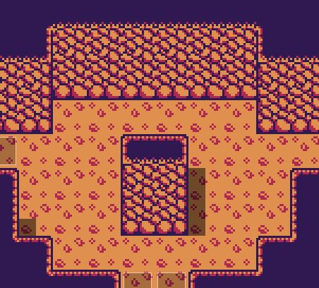
Tiles
Tiles encompassed the majority of the assets I was able to start before the jam. I had a whole test house done before other priorities consumed my life! The floor was pretty much immediately reworked to have thinner boards, and I later took out the white since it looked too shiny and distracting and like a Mario block. The wall was in Snake’s Shack for a while but was ultimately redone.
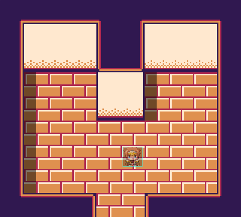
Not much can be said about the other tiles. It was a very straightforward process using a lot of reference art. I did end up using three different programs for the pixel art depending on my situation; Aseprite, GIMP which was annoying as hell, and Paint near the end when I was squeezing graphics into breaks at my job. I ended up using Aseprite to make finishing touches and ensure every sprite was using the same palette, regardless of what I used to initially draw the sprite. Most of the tiles also took quite a few iterations to perfect, and I'm glad I found the time for that.
I will say that far and away my favorite tile is the cave wall. I religiously studied Pokémon RBY and Bomberman Quest’s cave tiles and drew a bunch of lopsided circles with smaller circles in between. It got very frustrating fine-tuning it but it was worth the struggles!
Characters
Perhaps one of the biggest lifesavers of the whole jam was a pixel art test I did in Graphics Gale a little over a year ago. It was a simple, albeit rough and incomplete, Pokémon-style character using the palette I was initially planning for H&TCoT. To save time, I ended up resuscitating this template, tweaking and finishing it, and simply adding character-specific details in a new layer in Aseprite. This meant I created sprites for every character in a single night! This was a huge motivator, both in terms of how fast I could sprite and seeing proper characters ingame after dealing with RTP sprites for so long.

An early plan was to include portraits that contained the characters’ names, very much like the abilities in Kirby’s Adventure. However, when getting text boxes and Sfonts set up, I found out that portraits hardly fit! I ended up cutting them to lean into the Game Boy aesthetic and reduce scope.
Enemies
Some of my bigger scope-cutting measures revolved around enemy sprites. I only drew one overworld sprite for each enemy instead of walking or directional sprites, and I also used overworld sprites as battler and enemy sprites in combat. I nearly did front-view battles at first, but this would require drawing more complicated sprites or having an overworld enemy awkwardly floating in the middle of the screen.
Enemy sprites almost always used some sort of reference. The Crab was drawn using a sprite from Kong: The 8th Wonder of the World, which I had never heard of beforehand. The monkey was heavily based on Salsa from Mother III, and I gave him a mohawk or pompadour because I thought it would be funny. It wasn’t even just existing sprites; I used images of tiki yard decorations as reference for the Tikis in the cave! I paid close attention to how each sprite or image was dimensioned and laid out, but ultimately I drew the enemy sprites by hand. Except…
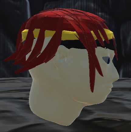
Teebeyae himself! You’ll find out how he came to be tomorrow, but long story short he’s based on Harold The Head: TBA by ronaldbabe and ManuGamingCreations. It was a few days to the deadline at this point, so I just took a screen capture from ingame, pasted it into Aseprite, and added a border, a podium, shading, and refinement. Honestly the hardest part was just getting Harold the Head to look to the side instead of straight at me!

Revenge of the Daily Doodle
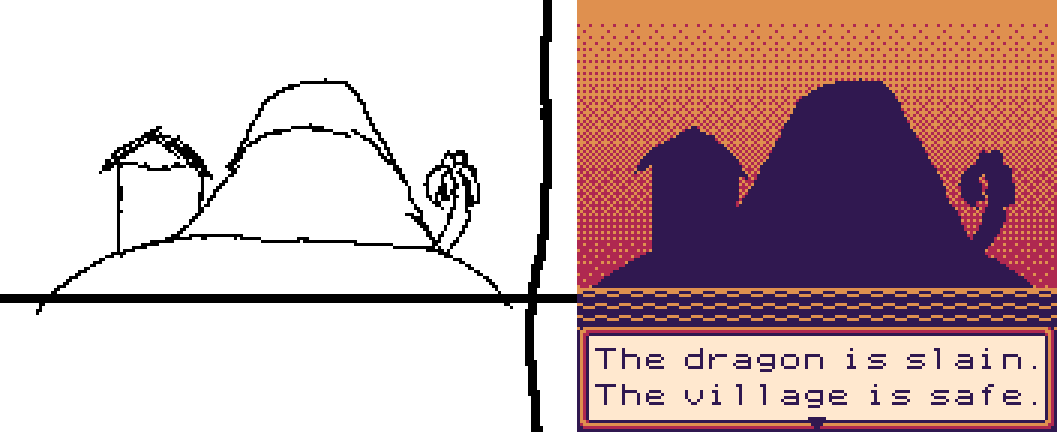
Remember my Flipnote doodles from Stuck in the Liminal? Even a little hand-drawn art made it into Teebeyae! In the last three or so days of the jam, when I was already beginning to crumble under the towering amount of work left, I thought it would be a fun idea if I just threw some hand-drawn art in the intro! I decided to dust off the ol’ DSi and quickly sketch Teebeyae’s island. Note the crosshair in the doodle, which roughly marks a 160x96 area. I then took it into Aseprite, scaled it up to 3:1 pixel resolution, filled in the island, and threw a gradient behind it. Somehow this only took like ten minutes total!
Fonts
The fonts were the only graphics I didn’t make, although I did attempt to compress one font to no avail. The fonts are both Sfonts; ArtosSans for dialogue and 4x8mono for items and their flavor text, both by Devurandom. ArtosSans absolutely nails the Game Boy feel, and I couldn't put it down despite how little space I had for words! Also uncredited in the jam release due to time limitations is Khurasan, who did the Comic Lemon font I used for the logo.
Conclusion
I wasn’t expecting to do this much pixel art for H&TCoT, but I can’t say I’m mad that I bit the bullet. Graphics have always been the one thing preventing me from being able to make games almost entirely on my own, so I’m happy I put so much time into learning it this jam. I hope to keep making pixel art and work my way up from here. I’ve got a big game with little art direction and no sprites as of yet, and finding willing spriters is hard and expensive. I’ve been told it’s very likely I’ll have to take matters into my own hands, and H&TCoT has made me feel far more comfortable about this. Again, just gotta keep at it. The goal is to work my way from 16x16 to 24x48 tops.
Up next, we’ll dive into Story: Tales from the Bedeviled Atoll and how the story slowly and quickly shaped itself at the same time!
Leave a comment
Log in with itch.io to leave a comment.