Behind the Liminal Pt. 5: Graphics - The Art Collective
Stuck in the Liminal ended up with a full art team! Everyone who worked on the game contributed to its aesthetic in some way or another.
Violet Spinel
I would be nowhere as a game dev if I didn’t pay Violet in enough Axial bangers for me to use his tilesets. (I’d be nowhere as a game dev without Violet period, but anyway…) These absolutely carried SITL’s graphics, along with the overworld sprites he did for Kasey, Alex, and Ralph. Some of his Stuck in the Past sprites like Reid and the Slimes also returned for the sequel.
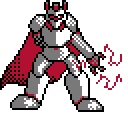
Fun fact; the Guardians are an unused Stuck in the Past enemy! Violet had whipped up an enemy he referred to as Dark Lord, but I was already set on how the final battle would go and wasn’t sure where he’d fit otherwise. Flash forward to Ascent of the Allies. With Violet occupied with two full Harold Jam games and so much else on top of that, I decided to save both of us the effort and use the Dark Lord as my concept for the Guardians for each floor. From there, the idea of Souls controlling suits of armor came naturally as many little plot points did.
Nateplays95
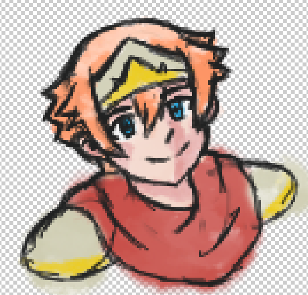
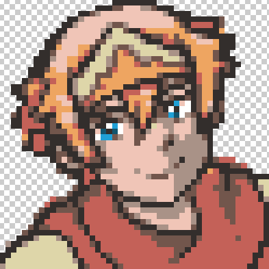
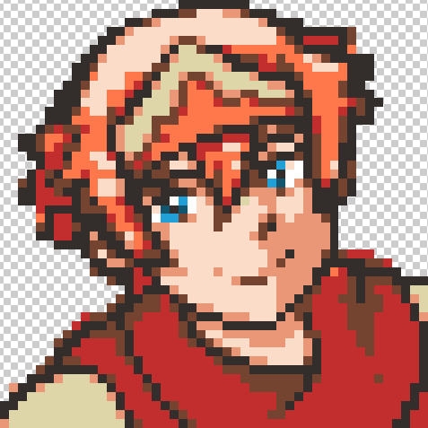
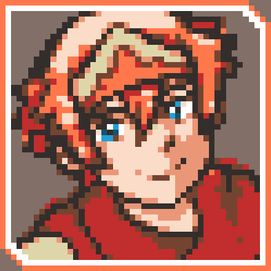
There is a reality where Nate did not volunteer to draw all the portrait sprites for SITL. Therefore there is a reality where I once again had to resort to the VX Ace character generator. No thanks. In any other scenario I would have opted for full sets of emotions for the cast, but Nate only had a few days before starting his own entry (which tragically didn’t get finished) and drowning in uni homework. For him to sneak these in was nothing short of a blessing.
Nate hand-drew the portrait sprites, shrunk them down to 1/3 of the portrait size, applied the palette I used in SITP, and rescaled to 3:1 pixel resolution. I was a little hesitant on hand-drawn sprites at first, but I should have never doubted the process. Nate also took this as practice since he’d be drawing plenty of Harold and Reid for his own entry.
Myria
Myria (or Marin of Taproots) isn’t exactly a household name in the RM Testers community. Hell, his name isn’t really out there at all, mostly by his own volition. With that said, this dude is the single best artist I have ever met and practically the reason I dove deep into The Colors of Life in the first place. His worldbuilding expertise and passion for TCOL made it more than just a passing thought, and just look at the concept art he willingly made for it!
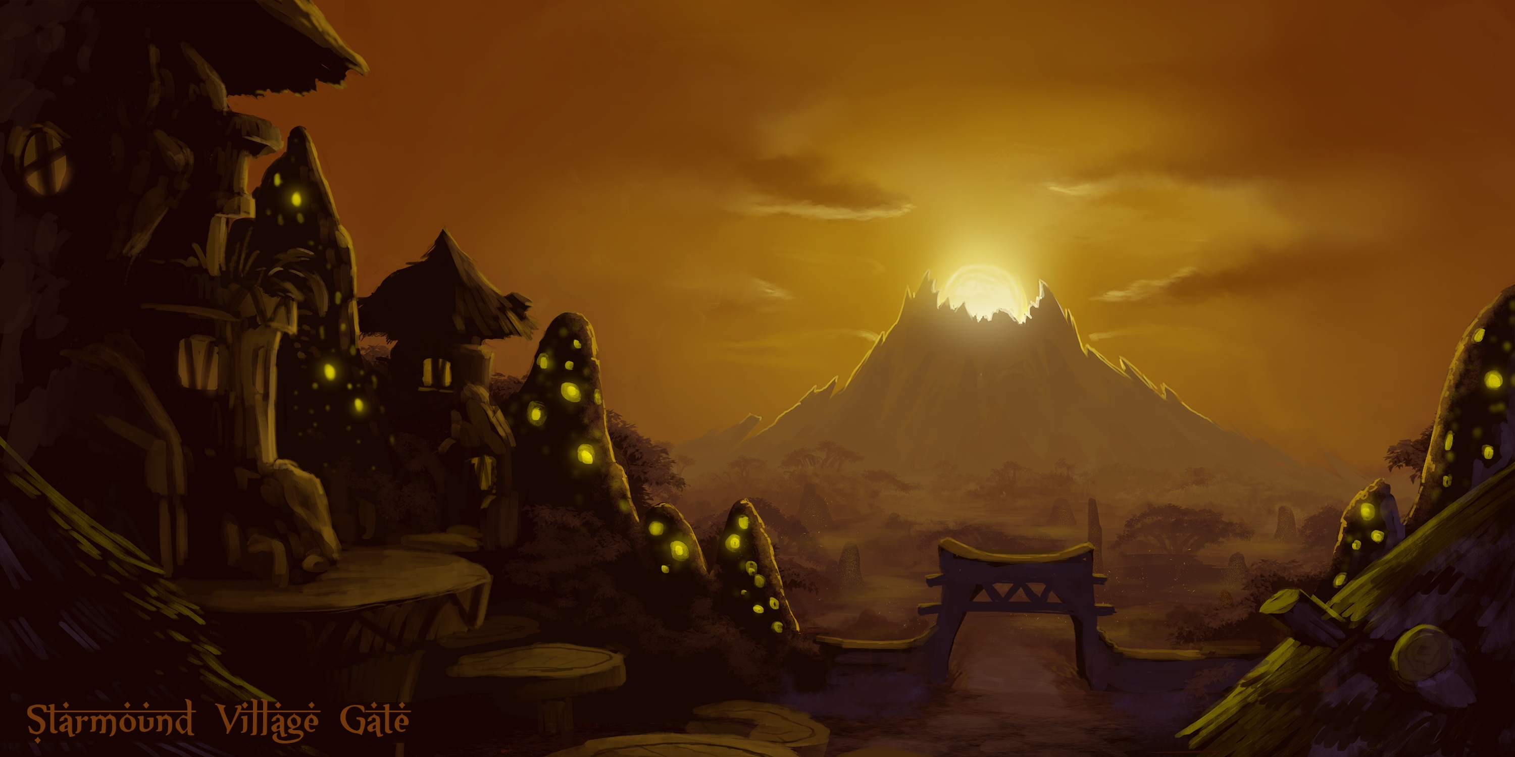
Myria wasn’t involved in SITL for the most part, and it even left a bad taste in his mouth during most of the month because all he knew was it was stressing me the hell out. However, I really wanted the entire TCOL team to make their impact on SITL, so I reached out to him for some title art. I pitched my idea, stressed the idea that it should be quick and painless, and he agreed. He managed to crank it out in a few days, and it looks stellar whether in full resolution or the 3:1 pixel ratio I ended up using.

Fun fact: SITL had a budget. I bought Myria dinner in exchange for the title art. Worth it.
DJ’s brother
Oh no! My game needs a logo! If only someone who graduated summa cum laude in graphic design and has designed professional logos for local businesses were in my immediate family! Reaching out to my younger brother for a logo was an absolute no-brainer. The problem was it would be tough to use the ingame font since I opted for an Sfont that would be absolutely tedious to turn into a logo. Nonetheless, my brother quickly whipped up this logo based on the different floors of the tower.

This logo did have a weird caveat though; its resolution and readability at a smaller size forced me to break my strict 3:1 pixel resolution rule. In retrospect I should’ve asked him to make the “In The” bigger, but I also didn’t want to make things too long and frustrating since there wasn’t a whole lot of time left.
callmeDJ
The one hurdle between me and being a somewhat well-rounded Guy Who Makes Games is art. I have not been able to create any kind of visual art for most of my life. Once I was dead set on Stuck in the Liminal, I made it a goal to fill in some gaps with my own pixel art and hopefully take a load off the rest of the artists. In short, I ended up...
- Recoloring Axial tilesets
- Creating and modifying tiles like archways that lead outside
- Editing columns and adding reflections
- Hand-drawing recolorable torches and doors
- Most Liminal outside tiles (heavily based on Axial)
- Creating Core, Faket, and Soul enemies
- Recoloring Reid’s Aspects
- Tracing a spiral staircase graphic by Mundy
- Editing some water sprites by Ocean’s Dream
- Editing Kato-San’s art of Human for the post-credits cutscene
- Modifying Violet’s Big Slime to include different colors and a Core
- Recoloring Violet’s Dark Lord and slimes
I’m most proud of the recolorable torches. I drew the base by hand based on the shape of the RTP torches. For the flame, I isolated a flame from a RTP torch, shrunk it down to 1/3 of the size, posterized it to reduce colors, recolored it, and then sized it back up. Turned out pretty well in my opinion.
The Core and Soul sprites were born out of necessity. I was half-begging Violet to crank just one variation of each out and I’d recolor them, but it didn’t sound like that was going to happen. I had to take things into my own hands and really get that pixel art practice I promised myself. Funny enough, my approaches were completely different for each enemy. The Core was done in Paint using the line tool and hand-placed pixels, whereas the Soul was drawn free-hand in GIMP! I based the Soul off the proportions of the Guardian sprites but adjusted when necessary. Happy with how both turned out, and I hope to keep pursuing pixel art over the course of the year.
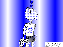
On the topic of drawing free-hand, how many of you stuck around to the end to see the currently unnamed TCOL protagonist pop up? I drew the images for the form cutscene on the last day and they didn’t come out as nicely as I would’ve liked. There’s more to this cutscene than just really bad scribbles though. The individual images are done in the style of what I call DJ’s Doodles, a (formerly) daily routine to crank out some very simple TCOL concept art in Flipnote Studio. Being able to actually see my ideas in front of my face has made a world of difference, even as a monochrome doodle made on a DSi. It’s also helping me learn how to draw which is super nice.
Up next, The Sound and Score of Stuck in the Liminal where my greatest skill gets to shine! There may also be a little something extra along with tomorrow’s devlog. Keep your ears peeled!
Get Stuck In The Liminal
Stuck In The Liminal
The sequel to Stuck In The Past!
| Status | Released |
| Author | callmeDJ |
| Genre | Role Playing |
More posts
- Beyond the Liminal Pt. 3: The Final ResultsJun 01, 2023
- V1.0.1May 18, 2023
- Beyond the Liminal Pt. 2: The Postmortem and ConclusionMay 07, 2023
- Definitive Edition!May 07, 2023
- Beyond the Liminal Pt. 1: The AnalysisApr 29, 2023
- Behind the Liminal Pt. 8: Lost Souls - The Cutting Room FloorApr 26, 2023
- Behind the Liminal Pt. 7: Overall - The JourneyApr 25, 2023
- Behind the Liminal Pt. 6: Music - The Sound and ScoreApr 25, 2023
- Behind the Liminal Pt. 4: Comedy - The CastApr 23, 2023
Leave a comment
Log in with itch.io to leave a comment.